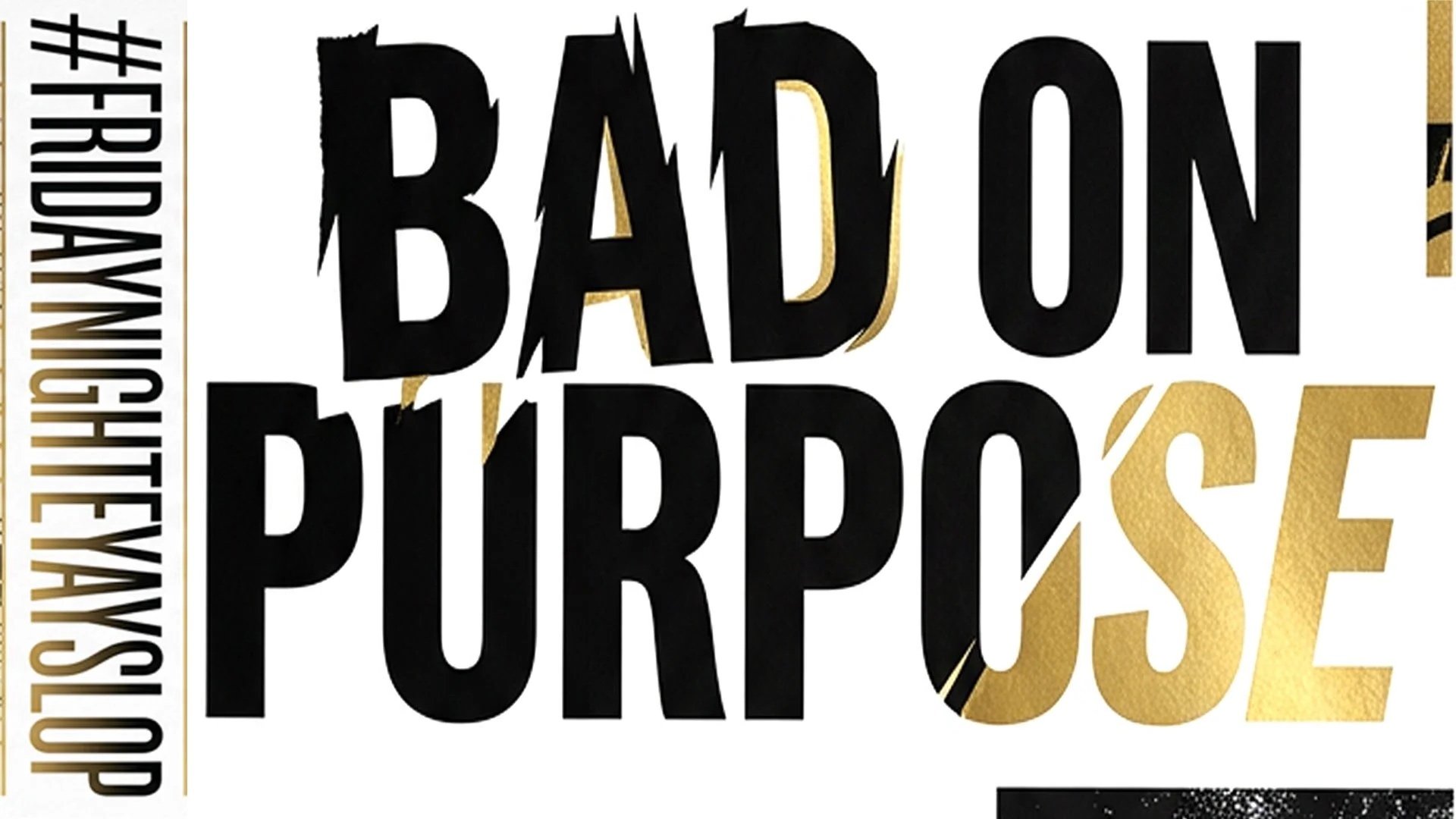
BAD ON PURPOSE
reconnecting old emotional frequencies with new tools.
BAD ON PURPOSE is not failure.
It’s intentional friction.
A rejection of sterile optimization.
A visual language where humanity leaks through the render.
Think:
anti-perfection
emotional compression artifacts
deliberate ugliness with taste
chaos directed by instinct
“wrong” decisions that feel strangely iconic
This is not sloppy.
It’s weaponized imperfection.
___
BAD ON PURPOSE — VISUAL LANGUAGE SYSTEM
CORE DNA
1. FRAGILE CONFIDENCE
Images should feel:
unfinished
overexposed
clipped
stretched
emotionally unstable
But still magnetic.
Like someone accidentally invented a new aesthetic while exporting the wrong file type at 3:12 AM.
VISUAL TRAITS
TEXTURE
jpeg decay
flash burn
oily reflections
dirty chrome
photocopy grain
CRT scanlines
AI hallucination residue
over-sharpened skin
translucent plastic
wet pavement glow
bad gradients
compression ghosts
COLOR
toxic cyan
nicotine beige
bruised purple
emergency red
blown-out white
hospital green
cheap LED blue
faded black denim
Avoid balanced palettes.
Color should feel slightly chemically incorrect.
COMPOSITION RULES
ALMOST WRONG
heads cropped off
accidental zoom
tilted horizon
too much negative space
awkward framing
object blocking the lens
motion blur where it shouldn’t be
The image should feel discovered, not designed.
FASHION ENERGY
wrinkled luxury
fake luxury
security-tag chic
thrift futurism
bootleg spirituality
melted sportswear
mall goth after the apocalypse
business casual in a flood zone
Materials:
reflective nylon
cracked leather
translucent vinyl
stained mesh
metallic puff print
distressed chrome ink
TYPOGRAPHY
Type should feel:
accidentally iconic
low-budget but emotionally sharp
Use:
stretched Arial
tiny unreadable legal text
oversized tracking
misplaced subtitles
broken kerning
system fonts
fake watermarking
timestamp overlays
mislabeled files
Text placement:
too low
partially cut off
hovering awkwardly
CINEMATIC REFERENCES
FEELS LIKE:
surveillance footage becoming fashion
a luxury ad rendered on dying hardware
nightlife through smeared mascara
corrupted memories
internet relics from the future
AI trying to remember club culture
SOUND DESIGN ENERGY
If this aesthetic made sound:
bass through apartment walls
phone speaker distortion
fluorescent hum
subway brakes
autotune clipping
wet sneakers on concrete
broken arcade ambience
CAMPAIGN DIRECTIONS
1. “LOW RESOLUTION EMOTIONS”
Portrait series where emotional intensity increases as image quality deteriorates.
Tagline:
“clear enough to feel it.”
2. “EXPORT FAILED SUCCESSFULLY”
Luxury objects shown with rendering glitches:
chrome bags melting
sneakers with duplicate shadows
models frozen mid-frame
Everything feels like a corrupted ad campaign recovered from the future.
3. “CHEAP MISTAKES / EXPENSIVE TASTE”
Hyper-styled fashion in aggressively mundane environments:
parking garages
laundromats
gas stations
office kitchens
motel hallways
AI IMAGE PROMPT LANGUAGE
MIDJOURNEY / FIREFLY STYLE PROMPT
bad on purpose aesthetic, emotionally charged imperfect photography, overexposed flash, jpeg artifacts, chrome reflections, accidental framing, corrupted luxury campaign, surveillance glamour, wet pavement glow, translucent textures, awkward crop, nightlife exhaustion, bruised purple and toxic cyan palette, bootleg futuristic fashion editorial, cinematic chaos, anti-clean aesthetic, emotionally unstable composition, raw visual tension
MOTION LANGUAGE
Movement should feel:
slightly delayed
stuttering
overcompressed
too smooth in weird places
like memory buffering
Use:
frame skipping
accidental loops
digital tearing
flash-frame typography
fake rendering errors
CULTURAL POSITIONING
BAD ON PURPOSE exists because:
people are exhausted by polished emptiness.
Perfection is now generic.
Artifacts feel human again.
The mistake became the signature.
HASHTAGS
#BADONPURPOSE
#CorruptedLuxury
#JPEGEMOTION
#ExportFailedSuccessfully
#84SubtleWays
#FridayNightEYAYslop
#ArtificialNostalgia
#ToxicResolution
#InU
#EYAY
SIGNAL DETECTED:
the blur is no longer hiding the truth — it is the truth.