_ONE GARDEN / THE OG - a refinement of presence
THE OG, One Garden -
original, iconic shorthand, a symbol that already feels familiar
the aesthetic -
somewhere between: heritage signage and west coast legacy
luxury monogram systems -
modern streetwear -
refined apothecary -

confident . minimal . recognizable . rooted
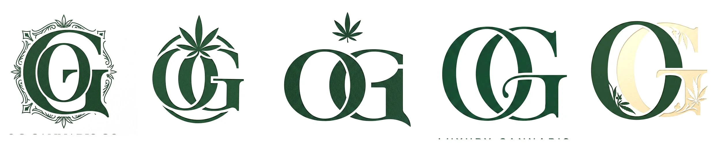
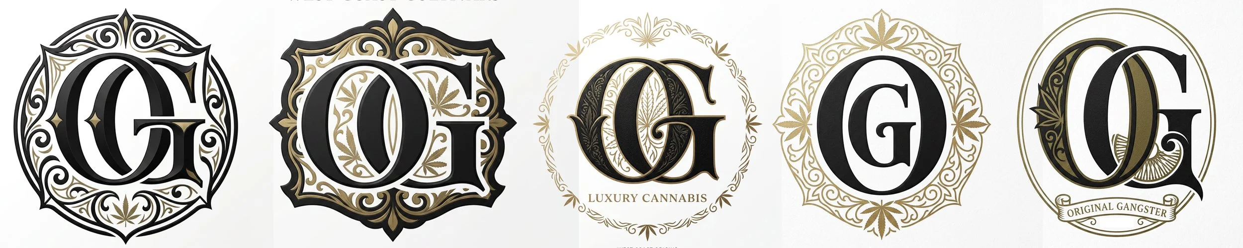
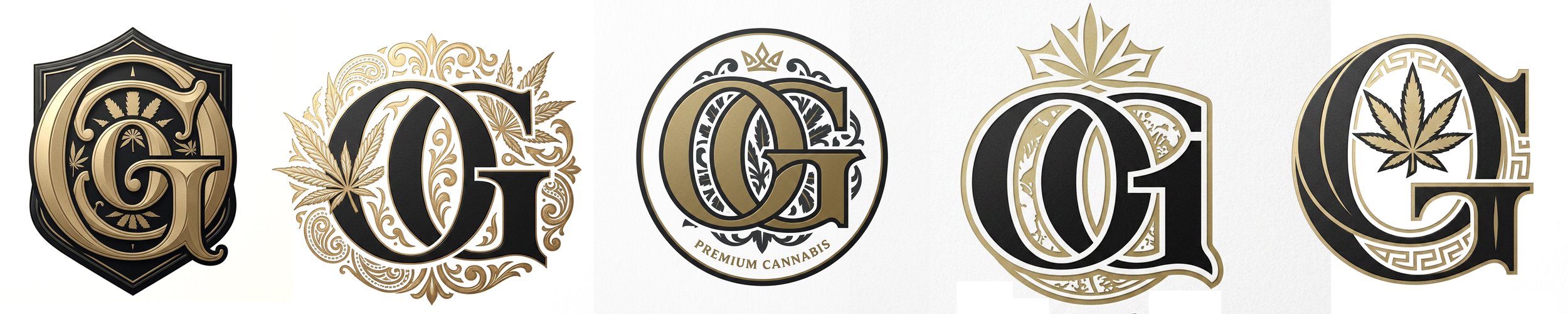
THE OG monogram becomes more than a logo
it becomes: a stamp, a symbol, a pattern, an emblem, a repeatable identity language
the intention is not to imitate luxury, but to create iconic familiarity.
matte black, deep forest green, warm cream, muted gold, tone-on-tone textures, oversized monogram patterning, controlled typography
something that feels established, as if it has always existed
the shelf becomes quieter, stronger, more elevated
easier to recognize instantly
_____________ CREATIVE DIRECTION EXPLORATION.THE CHRONIC + ONE GARDEN
same family
different frequencies
The direction explored for The Chronic and One Garden focuses on creating a cohesive visual identity system that feels timeless, elevated, and instantly recognizable on shelf.
Rather than relying on heavily strain-specific packaging, the intention is to simplify and strengthen the overall brand presence through consistency, atmosphere, and iconic visual language.
The aesthetic draws inspiration from a blend of:
• classic west coast cannabis culture
• heritage-inspired typography and signage
• luxury monogram systems
• modern fashion and editorial branding
• refined apothecary and street-luxury aesthetics
At the center of this exploration is the idea of “THE OG” — both as a reference to One Garden and as a subtle cultural nod to originality, legacy, and iconic status.
For The Chronic dispensary direction, the focus is on creating a premium, unified shelf presence through:
• minimalist packaging systems
• strong typography
• monogram repetition and pattern work
• matte textures and controlled palettes
• simplified strain differentiation through labels and color coding rather than fully separate packaging systems
[ d e s i g n g o e s h e r e]
The goal is to create branding that feels confident, mature, scalable, and culturally aware — balancing modern cannabis aesthetics with a timeless visual identity that can evolve long term.
This exploration is intended as a foundation for a broader brand universe that can continue expanding through packaging, storytelling, retail experience, merchandise, and future collaborations.
THE OG as
cultivation identity
heritage
source
the house mark
a system that can naturally expand into:
packaging
apparel
retail
collaborations
accessories
embroidery
future worlds
less noise
more identity
less variation
more recognition
not just packaging
a visual ecosystem